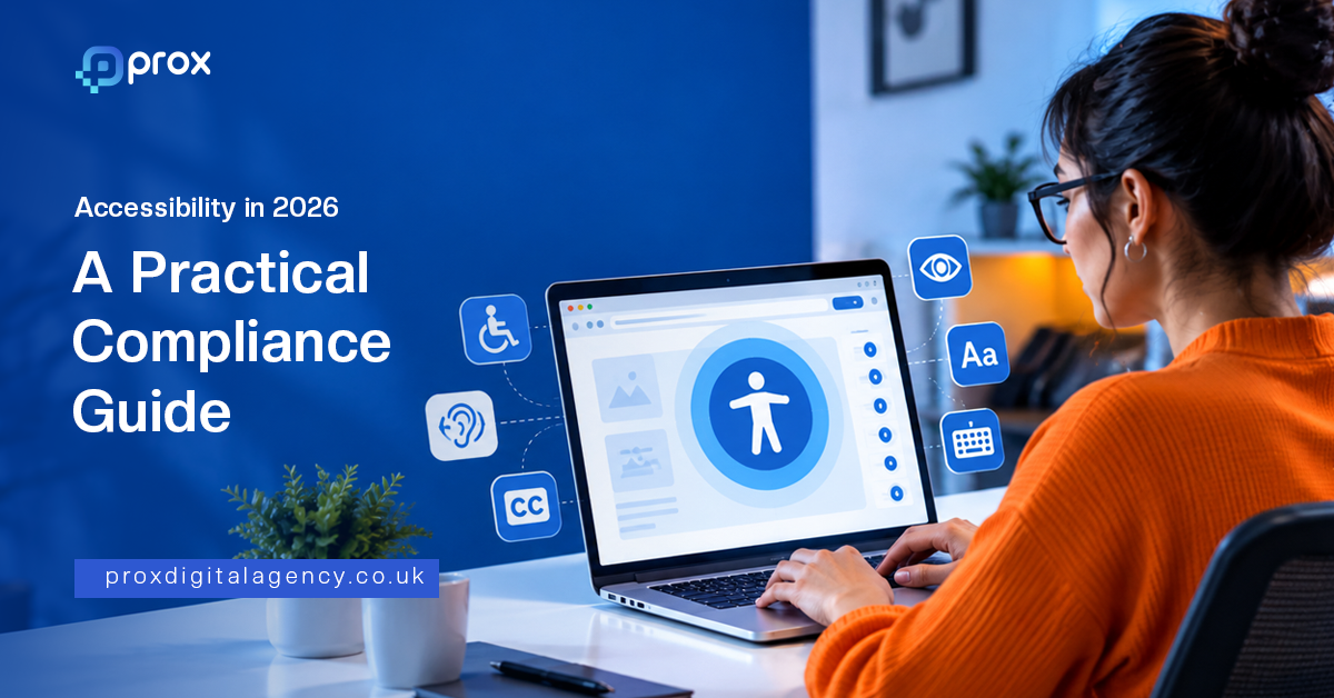
A website can look polished, load quickly and convert reasonably well while still putting up invisible walls for some of the people trying to use it. A button may be impossible to reach without a mouse. A pale grey heading may disappear into a white background for someone with limited vision. A form may look perfectly obvious to you but become a frustrating maze when read aloud by a screen reader.
That is the uncomfortable thing about accessibility. The problem is often invisible to the people who built the website.
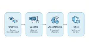
It is also why accessibility should not be treated as a final checkbox before launch. WCAG 2.2 organises accessibility around four principles: content should be perceivable, operable, understandable and robust. The standard contains testable success criteria across Levels A, AA and AAA, with AA commonly used as the practical target for many accessibility programmes. (W3C)
For a business, the question is therefore bigger than, “Does our website pass a scan?” A better question is, “Can our customers actually use it?”

What Accessibility Actually Means in Practice
Think about the last time you visited a website and everything simply worked. You could see the navigation, understand the page, move through the menus, complete the form and find the information you needed without stopping to think about the mechanics behind it. Good accessibility should feel much the same. The difference is that not everyone experiences the web through the same combination of sight, hearing, movement, touch and technology. Some visitors use screen readers. Others enlarge text, navigate with a keyboard, use voice controls or rely on captions. WCAG provides a common framework for designing around those different experiences. ( Accessibility is one strand of good design overall; our complete web design guide sets out the wider principles it sits within.W3C)
Perceivable
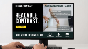
Information needs to be presented in ways people can actually perceive. That might mean providing useful alt text for meaningful images, captions for video, sufficient colour contrast and content that can be presented in different formats without losing its meaning.
The principle sounds technical. In practice, it is quite human. If a chart contains the most important information on a page but its meaning disappears when someone cannot see the chart, the website has failed to communicate. The information exists. The access to it does not.
Operable
People need to be able to use your website’s controls and navigation. That includes people who cannot use a mouse and instead move around a page with a keyboard or another input method.
Menus, buttons, forms, pop-ups and interactive components should not become dead ends. WCAG 2.2 also adds newer criteria around areas such as focus visibility, dragging movements, target size and accessible authentication. (W3C)
Understandable
A website should not make people decode its intentions. Forms need clear instructions. Error messages need to explain what went wrong. Navigation should behave predictably. Content should be readable and structured logically. This matters to everyone, but especially to people who may already face additional cognitive or processing barriers. A confusing checkout does not become accessible simply because every button technically works. That clarity is also what earns confidence — we cover it in more depth in how to design a website that builds trust.
Robust
Finally, the website needs to work reliably with different browsers, devices and assistive technologies. This is where good development discipline matters. Semantic HTML, correctly labelled controls and sensible document structure give assistive technologies something meaningful to interpret. WCAG describes robustness as compatibility with current and future user agents, including assistive technologies. (W3C)
Accessibility, then, is not one design trick. It is a chain. Break one important link and the experience can fall apart.
The Compliance Checks Most Websites Fail
Here is where accessibility becomes much less theoretical. You do not need to inspect a thousand lines of code to find problems. Some of the most common barriers are sitting in plain sight.
The 2026 WebAIM Million report found detectable accessibility failures on 95.9% of the one million home pages it tested. Low-contrast text appeared on 83.9% of pages, missing alternative text on 53.1%, and missing form labels on 51%. These are automated findings, not a declaration that every page is legally non-compliant, but they show how widespread the basic problems remain. (WebAIM)
Colour Contrast
What it looks like:
Light grey text on a white background. Thin text over an image. A button whose label nearly disappears against its background. Sometimes the design looks elegant on a designer’s monitor and becomes exhausting to read in the real world.
Who it excludes:
People with low vision or certain forms of colour blindness can struggle to distinguish text and interface elements. The problem can also affect anyone using a screen in poor lighting or at an awkward angle.
How to fix it:
Check text and interface contrast against the relevant WCAG criteria rather than judging it by eye. Do not rely on colour alone to communicate information. If red means “required”, for example, the form should also communicate that fact through text or another accessible cue. (ADA.gov)
Missing Alt Text
What it looks like:
An important image has no alternative text, or its alt text says something useless such as “image” or repeats information already provided beside it.
Who it excludes:
People using screen readers may miss the purpose or information contained in the image.
How to fix it:
Give meaningful images concise, useful alternative text. Decorative images can be treated differently, but an image carrying information needs an equivalent way for the user to access that information. WCAG requires text alternatives for non-text content, with specific exceptions. (W3C)
The trick is not to describe every pixel. Describe the purpose. If an image shows a product being used, explain what matters about that scene. If it is purely decorative, do not burden someone with unnecessary commentary.
Keyboard Navigation
What it looks like:
You press Tab and suddenly have no idea where you are. A menu opens but cannot be operated. A pop-up traps you. A button works beautifully with a mouse and does absolutely nothing when approached from the keyboard.
Who it excludes:
People who cannot use a mouse because of motor, visual or other disabilities may rely on keyboard navigation or alternative input methods.
How to fix it:
Try using the website without touching the mouse. Move through navigation, links, forms, menus and pop-ups with the keyboard alone. Every important interactive function should remain usable, and users should not become trapped inside components. Keyboard accessibility is a core part of WCAG’s operable principle. (W3C)
Form Labels
What it looks like:
A form contains boxes for name, email, phone and message, but the labels are missing, unclear or only appear as disappearing placeholder text.
Who it excludes:
People using screen readers can struggle to understand what each field requires. Poor instructions and error handling can make the process even harder.
How to fix it:
Give every form control a meaningful, programmatically associated label. Make instructions clear and ensure errors are communicated in a way assistive technologies can interpret. The US Department of Justice specifically identifies labels, clear instructions and useful error indicators as important elements of accessible online forms. (ADA.gov)
Focus Indicators
What it looks like:
You tab through a page and the active element seems to vanish. You know the keyboard is moving, but you cannot tell where it has gone.
Who it excludes:
Keyboard users need a visible indication of where they are on the page. Without it, navigation becomes guesswork.
How to fix it:
Keep a clear, visible focus state around links, buttons, form fields and other interactive elements. Do not remove the browser’s focus indicator simply because it does not match the visual design. WCAG 2.2 introduced additional criteria concerning focus appearance and focus not being obscured. (W3C)
Video Captions
What it looks like:
A product demonstration, training video or promotional film contains important spoken information but provides no captions.
Who it excludes:
People who are deaf or hard of hearing may miss the information entirely. Captions can also benefit people watching without sound, working in noisy environments or consuming content in situations where audio is impractical.
How to fix it:
Provide accurate, synchronised captions for relevant video content. Do not treat auto-generated captions as automatically correct. Names, technical terms and context can all be misinterpreted. WCAG includes specific requirements for captions and other alternatives for time-based media. (W3C)
Heading Hierarchy
What it looks like:
A page jumps from H1 to H4 because the designer liked the font size. Sections are visually separated but the underlying structure makes little sense.
Who it excludes:
Screen reader users often use headings to understand and navigate a page. A confusing hierarchy makes a long article or complex service page much harder to scan.
How to fix it:
Use headings to describe the actual structure of the content. Keep the hierarchy logical and do not choose heading levels purely because of how they look. The 2026 WebAIM data found skipped heading levels on 41.8% of home pages tested. (WebAIM)
That last statistic is worth sitting with for a moment. Something as basic as structuring a page properly is still routinely overlooked.
Where the Law Applies to You
The technical principles can be shared globally. The legal position cannot. This distinction matters because saying “WCAG 2.2 AA is the law” is an oversimplification. WCAG is a technical accessibility standard. The obligations that apply to a business depend on its market, sector, services and circumstances.
UK: Equality Act 2010
In the UK, the Equality Act 2010 provides protection against disability discrimination and includes duties around reasonable adjustments for services provided to the public. The Equality and Human Rights Commission explains that service providers may need to take positive steps to ensure disabled people can access services, rather than simply waiting for someone to request an adjustment. (equalityhumanrights.com)
For a website, that makes accessibility part of the broader customer experience rather than something that belongs solely to the development team.
USA: ADA and Section 508
In the USA, the Americans with Disabilities Act is particularly important for businesses open to the public, while Section 508 applies to federal agencies and covered government information and communication technology. The Department of Justice states that inaccessible web content can prevent people with disabilities from accessing goods, services and programmes offered online. (ADA.gov)
The exact obligations vary according to the organisation and context, so businesses should not assume that running a single WCAG scanner settles the legal question.
EU: European Accessibility Act
The European Accessibility Act became applicable on 28 June 2025 and covers a range of products and services, including e-commerce, consumer banking and certain electronic communications and transport services. It establishes common accessibility requirements across covered markets, with specific exemptions and national implementation considerations. (Consilium)
If your business sells covered services into the EU, accessibility should therefore be considered as part of the commercial and compliance process, not added after the website is already live.
Australia: Disability Discrimination Act 1992
Australia’s Disability Discrimination Act 1992 makes disability discrimination unlawful across areas of public life, including the provision of goods and services. The Australian Human Rights Commission specifically recognises online services as an area where accessibility needs to be considered. Its 2025 digital accessibility guidelines provide practical guidance for organisations seeking to meet their obligations. (humanrights.gov.au)
The common thread across these markets is simple: accessibility is increasingly difficult to dismiss as somebody else’s problem.
What It Costs to Ignore
There is a strange habit in digital work of treating accessibility as an expense until something goes wrong. Then it becomes an emergency. The first cost is the obvious one: legal and compliance exposure. The precise risk depends on jurisdiction, organisation and circumstances, so no responsible agency should promise that meeting a particular WCAG level makes a business legally bulletproof. But the direction of travel is clear. Governments and regulators increasingly expect digital services to be usable by people with disabilities. ( The quieter cost is behavioural: people who cannot complete a journey simply leave, which is exactly how the web design mistakes that quietly kill conversions tend to operate.ADA.gov)
The second cost is commercial. Someone who cannot navigate your website does not necessarily send you a complaint. They may simply leave. That abandoned enquiry, unfinished checkout or unanswered form can disappear from your analytics as if it never existed.
Then there is the overlap with good web practice. Clear headings, meaningful links, sensible structure, useful alternative text and properly labelled controls can improve the experience for everyone. Some of these practices also make pages easier for search engines and other technologies to interpret. Accessibility is not an SEO shortcut, but well-structured, usable content often creates benefits across several parts of the digital system.
How to Test Your Own Site in 30 Minutes
You can learn a surprising amount in half an hour. Start with an automated scan using tools such as WAVE, Lighthouse or axe DevTools. These can surface common technical problems such as missing labels, contrast issues, empty controls and other detectable failures. WAVE, for example, provides visual feedback and a structure panel that can help you inspect headings, regions and page elements. ( These checks overlap with the wider quality signals Google measures — see how Core Web Vitals affect rankings.WebAIM)
Then switch off the mouse. Use your keyboard to move through the homepage, navigation, forms and any important interactive components. Can you tell where you are? Can you open the menu? Can you close it? Can you reach every important control? Can you complete the main conversion action?
Finally, choose a page with meaningful content and ask someone to inspect it using a screen reader if you have access to one. Listen to how headings, links, buttons and form fields are announced. The experience can be revealing because accessibility problems often become obvious only when the page is experienced differently.
A word of caution: do not mistake an automated scan for an accessibility audit. WebAIM’s practitioner research found that only 17.6% of respondents believed automated testing could detect half or more of all accessibility issues. The most common estimates clustered around 20–40%. (WebAIM)
Automation is excellent at finding certain repeatable problems. It cannot reliably decide whether your alt text makes sense, whether your instructions are genuinely understandable or whether a complex journey feels usable to someone relying on assistive technology.
The green tick is not the finish line. It is the invitation to look closer.
Your 30-minute first check:
- Run WAVE, Lighthouse or axe.
- Review colour contrast failures.
- Check images for meaningful alt text.
- Navigate the site using only a keyboard.
- Test forms and error messages.
- Check the heading structure.
- Review important videos for captions.
- Record the issues rather than assuming the site is compliant.
When to Get a Professional Audit
A quick scan is a useful starting point. A professional audit becomes more valuable when the website matters commercially and the consequences of getting accessibility wrong are higher. That might be a large ecommerce site with hundreds of templates. It might be a healthcare organisation handling sensitive journeys. It might be a B2B platform with complicated forms and account areas. Or it might simply be a business preparing for a major redesign after years of incremental changes. The difficulty is that accessibility problems rarely live in one place. A developer may fix the code while the content team continues publishing images without meaningful alternatives. A designer may improve contrast while a new third-party booking system introduces an inaccessible interaction. A marketing team may create a beautiful campaign landing page that quietly breaks keyboard navigation. That is why a proper accessibility audit should look at the whole experience: structure, content, interactions, forms, navigation, templates and the way real users move through important journeys. At Prox Digital Agency, an accessibility check can give you a clearer starting point before you commit to a larger remediation project. You do not need to know how broken your website is before asking for it to be checked. It is also the point where accessibility work overlaps with a wider redesign, which our web design guide walks through.
Not sure how accessible your website really is?
Get a free accessibility check from Prox Digital Agency. We can identify the obvious barriers, highlight the areas that deserve closer attention and give you a practical picture of where to start. If accessibility is already part of your next website project, it also makes sense to build it in from the beginning rather than retrofit it later. Our Complete Web Design Guide 2026 covers the wider principles behind building a stronger digital experience, while accessibility should sit inside that process rather than beside it. You can also explore our web design and development service.
FAQ
What is website accessibility?
Website accessibility means designing and developing a website so people with different disabilities can perceive, navigate, understand and use its content and functionality. It includes considerations such as keyboard access, colour contrast, alternative text, captions, form labels and compatibility with assistive technologies. WCAG 2.2 provides a widely used technical framework for evaluating these areas.
What is WCAG 2.2 AA compliance?
WCAG 2.2 AA refers to meeting the applicable Level A and Level AA success criteria within the Web Content Accessibility Guidelines 2.2. WCAG is organised around four principles: perceivable, operable, understandable and robust. It is a technical accessibility standard, not a single global accessibility law, so legal requirements still depend on the market and circumstances. (W3C)
Is website accessibility legally required?
Accessibility obligations vary by country, industry and organisation. The UK has duties under the Equality Act 2010, the USA has the ADA and Section 508 for relevant public-sector contexts, the EU has the European Accessibility Act for covered products and services, and Australia has the Disability Discrimination Act 1992. Businesses should assess the rules applicable to their particular operations.
Does the ADA apply to websites?
The US Department of Justice has stated that the ADA applies to the services, programmes and activities offered online by state and local governments, and that Title III applies to businesses open to the public. The precise obligations and applicable technical requirements depend on the organisation and context, so an automated WCAG scan should not be treated as legal advice or proof of compliance. (ADA.gov)
How can I test my website for accessibility?
Start with an automated tool such as WAVE, Lighthouse or axe DevTools to identify common technical problems. Then test the site manually using only a keyboard and review important content, forms, navigation and interactive elements. Automated testing cannot evaluate every aspect of accessibility, so a comprehensive assessment should combine automated checks with manual review and, where appropriate, assistive technology testing. (WebAIM)
Can accessibility improvements improve SEO?
Accessibility is not a shortcut to higher search rankings, and WCAG compliance should not be sold as an SEO guarantee. However, several accessibility practices overlap with strong technical and content practices. Clear headings, descriptive links, meaningful text alternatives, logical structure and usable navigation can make content easier for people and technologies to understand. That makes accessibility a valuable part of broader website quality.
How do I know if I need an accessibility audit?
Consider a professional accessibility audit if your website is commercially important, serves a broad public audience, operates across multiple markets, contains complex forms or interactions, or has never undergone a proper accessibility review. It is also worth considering before a major redesign, when fixing structural problems early is usually more efficient than discovering them after launch.


 US
US UK
UK +44 (7) 43 8304 605