The real reason is often simpler yet harder to spot. These conversion killers are mostly small web design mistakes that work quietly in the background. They confuse visitors and add friction where there should be none.
Nobody complains about these things. Buyers just leave, quietly, without making any purchases.
At Prox Digital Agency, we audit websites for a living. We see the same conversion killers repeat across industries and geographies. The businesses change. The design mistakes stay the same. To identify these mistakes early, we’ve compiled this playbook for you.
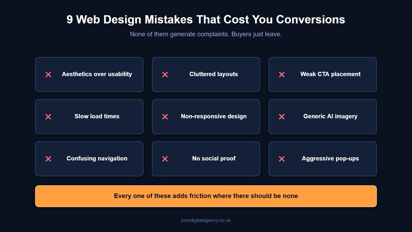
Here are the nine most common ones. Fix these before you spend another dollar on driving traffic.
Top 9 Web Design Mistakes That Quietly Kill Conversions
Mistake #1: Prioritising Aesthetics Over Usability
Your website is quite beautiful, but it means nothing to visitors as they cannot use it.
This is the most common trap. Designers chase awards. Business owners chase trends. Clarity gets left behind in the process. Fancy animations and unusual navigation menus confuse first-time visitors.
The problem:
A visitor lands on the page. They pause, scan, and when the path forward is not instantly obvious, they hit the back button.
The quick fix:
Give your visitors standard layouts. Familiar icons. Clear labels and call-to-actions. Your design should guide them, not impress them. This is a conversion rate optimisation mistake with an easy fix.

Mistake #2: Cluttered Layouts That Overwhelm Visitors
Too much choice kills action.
Homepages that try to say everything at once, such as five banner sliders, three pop-ups, a live chat widget, social proof notifications, a newsletter sign-up, a video, a “meet the team” section, and whatnot.
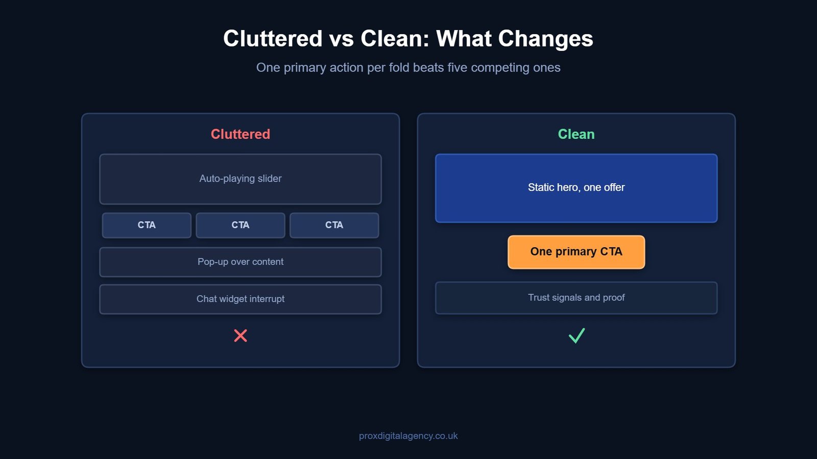
Visitors land on this type of homepage and instantly freeze. This classic UX design mistake, aka ‘Hick’s Law,’ leads to longer decision time, and that usually results in no decision at all.
| Cluttered Layout Signs | Clean Layout Signs |
|---|
| Multiple competing CTAs | One primary action per fold |
| Auto-playing sliders | Static hero section with a single offer |
| Dense text blocks | Short paragraphs with breathing room |
| Everything above the fold | Progressive disclosure of information |
The quick fix: Reduce clutter on your pages. Your landing page should focus on one action at a time. Follow our clean layout checklist to fix it. And that’s all it takes.
Mistake #3: Weak CTA Placement
Your CTA is your sales door. Do not hide it. This is one of the most common website design errors that hurt sales across every sector.
The problem:
A page explains the offer well. It builds a decent case. Then it ends with a link that vaguely says “Submit” or “Learn More.” Nobody gets excited about submitting anything. That’s what a weak CTA looks like.
The quick fix:
- Make CTAs specific, for example, “Get Your Free Audit” beats “Click Here.”
- Make them high-contrast buttons as they beat low-contrast links.
- Place CTAs where the visitor’s interest peaks, not just at the very bottom of the page.
- Test different versions. Button colour. Copy. Position. A small lift here allows big changes.
Mistake #4: Slow Load Times in a 5G World
In 2026, speed expectations have changed drastically. Many businesses assume fast networks solve slow websites. They do not. Even on 5G, a poorly built site takes time to render. Our breakdown of how Core Web Vitals affect rankings covers which speed metrics Google actually measures. And the buyer’s patience is thinner than ever.
This is a critical web design mistake because the damage happens before anyone sees your content.
The problem:
A widely cited industry benchmark puts the cost of a single extra second of load time at up to a 7% drop in conversions on mobile. Pages that take over three seconds lose more than half their visitors before the first scroll.
Core Web Vitals remain a ranking signal. But slow loading simply feels unprofessional and signals neglect.
The quick fix:
- Compress images to next-gen formats like WebP
- Use a content delivery network for global audiences
- Test your site on a throttled connection. That is how many of your visitors experience it.
- Reduce third-party scripts, especially on mobile
Mistake #5: Non-Responsive Design
Responsive design used to mean mobile-friendly. Our complete web design guide sets out the principles behind layouts that hold up across devices.
Devices have changed. Foldable phones open into tablets. Users browse on smartwatches while commuting. Desktop monitors span ultra-wide resolutions. A site that simply “resizes” is not enough.
The problem:
This web design mistake kills conversions by creating hidden friction. Buttons become too small to tap on small viewports. Text columns stretch endlessly on ultrawide screens. Forms break at certain breakpoints.
The quick fix:
- Use a responsive CSS framework that auto-scales layouts across all screen sizes.
- Test on real devices every month or after a certain time to check if they’re still working fine on different devices.
Mistake #6: Generic AI-Generated Imagery That Destroys Trust
AI-generated images are everywhere now. Visitors can spot them instantly and are tired of them.
The problem:
Generic stock photography has always had a trust problem. Teams smiling at laptops in glass offices. AI tools have flooded the web with images that feel hollow and slightly uncanny.
This is a new UX design mistake that directly hurts conversions. If your imagery feels fake, visitors may not see your business or brand as authentic.
The quick fix:
- Real photos perform better. Always. Your actual team. Your actual workspace. Your actual product being used. Imperfections are fine. Authenticity matters.
- If you’re using stock or AI-generated imagery, use it sparingly. Blend it with real photos. Avoid the obvious synthetic look.
Mistake #7: Confusing Navigation and Dead Ends
Navigation is a promise. It tells visitors they can find what they need. Broken navigation breaks that promise.
The problem:
A dropdown menu with too many layers. A missing search bar. Footer links that lead nowhere. Mobile menus that cover half the screen without a clear close button.
When visitors hit a dead end, they reverse back.
The quick fix:
Here is a clean navigation audit checklist:
- The main menu should be visible without scrolling on the desktop
- The search bar must be accessible on every page
- Zero broken links across the site
- Clear breadcrumbs on inner pages
- Footer must be organised by logical categories
Spend an afternoon clicking every link on your site. Fix every 404. The result? Better conversions.
Mistake #8: Zero Social Proof and Missing Trust Signals
Visitors do not trust your claims. They trust what others say about you.
The problem:
A site without testimonials, reviews, or case studies asks visitors to take a leap of faith. The lack of social proof is a problem, and it quietly kills conversions across every industry.
The quick fix:
- Add at least three trust signals near every CTA, such as client testimonials, security badges, or client logos, which work best.
- Display real-time activity if you have traffic. “59 people viewing this product now” or “Sold 72 in the last 24 hours” builds urgency and trust instantly.
Mistake #9: Aggressive Pop-Ups, Banners, and Chat Interruptions
Immediate pop-ups annoy visitors. Chat widgets that launch unsolicited conversations feel invasive. Sticky banners that push content down frustrate users on small screens.
The problem:
Most visitors never return after a single bad interruption. Rankings slide too, since Google actively penalises aggressive mobile interstitials.
The quick fix:
The fix is not to remove pop-ups entirely.
- Use them smartly.
- Delay them.
- Trigger them based on behaviour.
- Show them after a visitor has scrolled 60% of your web page.
Good pop-ups allow relevant value at the right moment. Bad pop-ups sacrifice long-term trust for short-term metrics.
One Silent Conversion Killer: A Complicated Checkout and Lead Forms
Poor forms reduce conversions. This silent web design mistake deserves its own section because it is so common and damaging.
The problem:
The page does its job. The visitor decides to buy. Then the form appears.
Too many fields. Forced account creation. Hidden shipping costs with unexplained invalid phone number errors. This type of cart abandonment rate sits above 70% on average — Baymard Institute puts the figure at 70.22% across 50 studies.
The quick fix:
- Ask only for information you absolutely need to confirm the order.
- Auto-fill wherever the browser can handle it.
- Allow guest checkout.
- Display all costs before the final step.
- Test your own forms monthly. Fill them out on mobile with one hand. This way, you will spot friction fast.
The Prox Digital Agency CRO Approach
A redesign is an investment with clear, measurable returns. Fix several of the mistakes above and you can often lift conversions meaningfully from the exact same traffic — though the size of the gain depends entirely on your starting point, traffic quality and offer. Without extra ad spend. Without new campaigns.
At Prox Digital Agency, we take a structured path to fixing conversion problems. Every single change ties back to a number that matters to your bottom line.
- First, we audit. We look at analytics and real user insights. We find exactly where visitors drop off and why.
- Not all fixes are equal, so we mark priorities. We identify the changes that will move the needle fastest.
- Finally, we implement and measure. We launch changes and track results.
Wrapping Up
The nine plus one major mistakes above explain how they quietly kill business conversions. The good part is, they are all fixable. They do not require a massive budget or a complete brand overhaul. Start seeing your website the way your visitors do, and you’ll see significant business success.
If you are ready to find and fix the conversion killers on your site, Prox Digital Agency is here to help.
FAQs
What is the most common web design mistake that kills conversions?
The most common web design mistake that hurts conversions is prioritising how a site looks over how it works. Visitors leave when they cannot find what they’re looking for. A beautiful but confusing website loses sales faster than a plain but clear one.
Does a slow page speed of a website affect revenue?
Yes. Even a single second of delay is commonly linked to a conversion drop of around 7%. If your web speed is slow, it will make your business look unreliable. Because visitors expect near-instant pages, and they will leave for a competitor within the next second.
Why is mobile responsiveness still a problem in 2026?
Mobile responsiveness is still a problem in 2026 because devices are changing fast. Different types of devices require different layouts. A site that works on a standard phone might break on a foldable.
Do AI-generated images actually lower trust?
Yes. Visitors are now smart enough to spot fake imagery, and it erodes trust instantly. Real photos are the source of building brand authenticity. Even if you have to use AI visuals, use them sparingly; always blend AI photos with real-product photography.
Can I fix the conversion killer mistakes myself, or do I need an agency?
The 9 common web design mistakes that kill conversions can be fixed easily. However, mistakes like accessibility compliance, complete CRO optimisation, and audits need external expertise.


 US
US UK
UK +44 (7) 43 8304 605