That makes colour one of the most powerful tools in modern web design. In 2026, brands no longer choose colours simply because they look attractive. They choose them because they communicate meaning. Every shade sends a signal. Every palette creates an expectation.
As designer and artist Wassily Kandinsky famously said:
“Colour is a power which directly influences the soul.”
That statement feels more relevant today than ever. Modern websites compete for attention in crowded digital spaces. Users make decisions quickly. They judge credibility almost instantly. In many cases, colour becomes the difference between staying and leaving. Choosing the right palette is not about personal preference. It is about strategic communication.
The Psychology Behind Colour Choices
Human beings naturally associate colours with emotions and experiences. These associations influence behaviour every day. When we see certain colours, our brains create immediate interpretations based on culture, memory, environment and psychology.
This is why colour psychology plays such an important role in branding and website design. The goal is not to manipulate users. The goal is to align visual communication with audience expectations.
A luxury fashion brand should not feel like a discount supermarket. A healthcare company should not feel like a nightclub. Colour helps establish those distinctions instantly. Let us explore the meanings behind some of the world’s most commonly used brand colours.
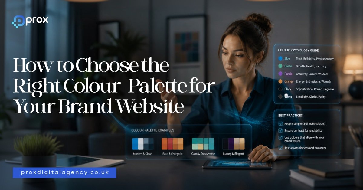
1- Blue Creates Trust and Stability
Blue remains one of the most popular brand colours in the world. There is a reason for that. Blue communicates reliability, confidence, security and professionalism. It helps people feel comfortable. It reduces perceived risk.
This explains why many financial institutions, technology companies and professional service firms use blue as a primary colour.
Think about brands such as:
- Facebook
- LinkedIn
- PayPal
- IBM
- Barclays
Each of these brands wants users to trust them. Blue supports that objective. In 2026, designers continue using blue heavily in sectors where credibility matters more than excitement. For businesses in finance, technology, consulting, legal services, cybersecurity, or SaaS, blue remains a strong option.
2- Red Captures Attention and Creates Energy
Red works differently. It demands attention. Red creates urgency, excitement, passion, movement and action. It often increases emotional intensity. This explains why many food brands and retail companies use red strategically.
Examples include:
- Coca-Cola
- Netflix
- YouTube
- Virgin
These brands want energy. They want engagement. They want users to notice them immediately. However, red requires careful handling. Too much red can feel aggressive or overwhelming. Strong brands often combine red with neutral colours to maintain balance. In web design, red works particularly well for promotions, calls to action and high-energy consumer brands.
3- Green Signals Growth and Wellbeing
Green continues to dominate sectors linked to health, sustainability, finance and wellbeing. People associate green with nature, balance, freshness and growth. That association feels especially relevant in 2026 as consumers become more environmentally conscious. Brands increasingly use green to communicate responsibility and long-term thinking.
Examples include:
- Spotify
- Whole Foods
- Animal welfare organisations
- Sustainable product companies
Green also works exceptionally well for fintech businesses because it naturally connects with wealth and financial growth. A well-designed green palette can create a calm and reassuring digital experience.
4- Yellow Brings Optimism and Positivity
Few colours feel as cheerful as yellow. Yellow communicates warmth, happiness, confidence and creativity. It attracts attention without creating the intensity associated with red. Many brands use yellow to create a friendly personality.
Think about:
These companies want to feel approachable and memorable. However, yellow works best as an accent colour on websites. Large blocks of bright yellow can create visual fatigue. Smart designers often pair yellow with darker tones to improve readability and balance.
5- Black Defines Luxury and Sophistication
Luxury brands understand the power of restraint. That is why black remains a favourite choice among premium companies. Black communicates exclusivity, elegance, confidence and authority. It creates contrast. It creates drama. It creates focus.
Some of the world’s most recognisable luxury brands use black extensively, including:
In website design, black works particularly well when paired with generous white space and strong typography. The result feels refined rather than cluttered.
As fashion designer Yohji Yamamoto once said:
“Black is modest and arrogant at the same time.”
Luxury brands understand exactly what he meant.
6- White Space Is a Colour Strategy Too
Many businesses focus entirely on colours and forget about what sits between them. White space matters. In fact, some of the strongest websites in 2026 use fewer colours than ever before. They rely on clean layouts, breathing room and visual simplicity. White creates clarity. It improves readability. It helps users focus on what matters.
Brands such as Apple have mastered this approach for years. Their websites rarely feel crowded because they allow content and products to breathe. Sometimes the smartest colour decision is knowing when not to add another colour.
Why Modern Brands Use Fewer Colours
One major design trend continues to dominate in 2026. Simplification.
Many brands are reducing colour complexity rather than increasing it. Instead of using six or seven competing colours, successful websites often rely on:
- One primary brand colour
- One supporting colour
- One accent colour
- Neutral backgrounds
This creates consistency across websites, apps, social media and marketing campaigns. It also improves recognition. When people see a colour repeatedly, they begin associating it with a specific brand. That consistency creates long-term brand equity.
Colour Is About Meaning, Not Preference
One of the biggest mistakes businesses make is choosing colours based solely on personal taste.
- A founder might love orange.
- A director might prefer purple.
But branding decisions should never begin with personal preferences. They should begin with audience expectations.
The right question is not: ‘What colour do we like?’
The right question is: ‘What colour helps our audience trust, remember and understand us?’
That shift changes everything. The most successful colour palettes are built around communication instead of over-ornate embellishments. And that is where strategic brand design begins.
Why Colour Matters More Than Ever in 2026
Colour influences perception long before content does. It shapes emotion, trust, credibility and behaviour within seconds. Every colour carries meaning. Every palette tells a story. The strongest brands understand this. They choose colours deliberately rather than emotionally.
Now, we will explore how different industries should approach colour selection, the biggest colour mistakes businesses make, the leading website colour trends shaping 2026, and a practical framework for building the perfect colour palette for your brand website.
Matching Colours to Your Industry
Choosing the right colour palette becomes much easier when you understand the expectations of your market. Different industries communicate different promises. Colours help reinforce those promises before a visitor reads a single line of copy.
This does not mean every business in a sector should use identical colours. It simply means certain colours naturally support certain messages. When colour and brand positioning work together, users experience consistency. When they clash, trust weakens.
Let’s explore some common examples.
1- Technology and SaaS Brands
As we all know that tech companies often rely on blue because trust remains a critical part of the buying process. People want confidence when they purchase software, cybersecurity solutions, cloud services or digital platforms.
Blue communicates stability and expertise. However, modern SaaS brands in 2026 are becoming more adventurous. Many now combine blue with vibrant accent colours such as:
- Purple
- Cyan
- Electric green
- Bright coral
This creates a balance between trust and innovation. Brands want to appear reliable, but they also want to feel modern and forward-thinking.
2- Financial Services and Fintech
Money creates emotion and people want security when making financial decisions. They also want confidence that a company understands their future goals. This is why blue and green continue to dominate financial branding.
- Blue suggests trust and professionalism.
- Green suggests growth, prosperity, and long-term success.
Many fintech brands now blend these colours with minimalist interfaces to create a clean and modern experience. The result feels less corporate and more approachable.
3- Healthcare and Wellness Brands
Healthcare websites need to create calm. Users often arrive with concerns, questions or uncertainty. Strong healthcare design reduces anxiety rather than increasing it.
This explains the popularity of:
- Soft blues
- Greens
- White backgrounds
- Muted neutral tones
These colours create feelings of safety and reassurance. Wellness brands often push this even further by introducing earthy colours inspired by nature.
Sage green, soft beige, clay tones and warm creams continue to grow in popularity throughout 2026.
4- Luxury Brands
Luxury branding follows a different set of rules. Luxury brands rarely try to attract attention through bright colours. Instead, they focus on exclusivity.
Black, charcoal, deep navy, gold and white remain dominant choices.
These colours communicate confidence without shouting. Luxury brands understand an important principle. True confidence rarely needs to be loud. That is why many premium websites feel simple, elegant and highly restrained.
5- Creative Agencies and Design Studios
Creative businesses have more freedom than most industries. Their websites often serve as proof of their creativity. Many agencies use bold colour combinations to create memorable experiences.
Bright gradients, vibrant accents and unexpected colour pairings continue to appear across agency websites in 2026.
However, successful agencies still maintain strategic control. They use colour to reinforce personality rather than create chaos. The best creative websites feel distinctive without becoming overwhelming.
6- Ecommerce and Consumer Brands
Retail brands often use colour to drive emotion and purchasing behaviour.
- Fashion brands frequently choose black and white palettes to keep attention on products.
- Beauty brands often use soft neutrals, blush tones, and muted pastels.
- Food and beverage companies frequently rely on warmer colours that stimulate energy and appetite.
- Consumer brands must think carefully about emotional triggers.
A website should feel consistent with the experience customers expect from the product itself.
The Biggest Colour Mistakes Brands Make in 2026
Choosing colours can be exciting. Unfortunately, many businesses make decisions that create confusion instead of clarity.
- One common mistake involves following trends without considering brand identity. A colour trend may look attractive today, but it may not align with your positioning.
- Another mistake involves using too many colours. When every element competes for attention, nothing stands out. Users struggle to understand hierarchy. The experience becomes visually exhausting.
- Some businesses also ignore accessibility. A beautiful palette loses value if users cannot comfortably read the content. Strong colour palettes balance aesthetics with usability.
Colour Trends Shaping Websites in 2026
Every year introduces new design trends. However, the strongest trends in 2026 focus on authenticity and emotional connection rather than visual gimmicks.
- One major trend involves natural colour palettes. Brands increasingly use colours inspired by nature because they create calm and credibility. Earthy greens, warm browns, soft blues, and organic neutrals continue gaining popularity.
- Another trend involves richer, deeper tones. Instead of bright primary colours, many brands now prefer sophisticated shades with greater depth. These colours feel more mature and premium.
- We also see increased use of subtle gradients. Unlike the loud gradients of previous years, modern gradients feel softer and more refined. They add depth without overwhelming the user experience.
- Dark mode design also continues influencing colour selection. Many brands now create palettes that perform equally well in both light and dark environments. This requires greater consideration of contrast, accessibility and visual hierarchy.
How to Build the Right Colour Palette for Your Website
Choosing a colour palette does not need to feel complicated. A simple framework can make the process much easier.
- Start with your brand personality. Ask yourself: What do we want people to feel when they visit our website? Do you want to appear trustworthy? Innovative? Premium? Friendly? Bold? Your answer should influence your primary colour choice.
- Next, select a supporting colour that complements your primary colour. This colour should reinforce your overall personality rather than compete with it.
- Then choose an accent colour. This colour should attract attention to important actions such as buttons, links, and calls to action.
- Finally, build a neutral foundation using whites, greys, or muted background colours. This foundation creates breathing room throughout the design.
Many successful websites rely on a simple formula:
- One primary colour
- One supporting colour
- One accent colour
- Neutral backgrounds
Simple often wins.
– Test Colours in Real Situations
Many brands choose colours in isolation. They view them as swatches rather than experiences. This creates problems. Colours behave differently when placed inside real interfaces. A colour that looks fantastic in a logo may perform poorly on a website. Always test colours within actual layouts.
Review them on:
- Desktop screens
- Mobile devices
- Dark mode environments
- Different lighting conditions
Observe how users respond. Strong branding comes from evidence instead of bogus assumptions.
– Colour Creates Memory
One of the most overlooked benefits of colour is memorability. People remember colours remarkably well. Think about some of the world’s most recognisable brands. You can often picture their colours instantly.
- The red of Coca-Cola.
- The blue of Facebook.
- The yellow of IKEA.
- The green of Spotify.
Colour helps brands occupy mental space. When used consistently, it becomes a shortcut to recognition. That recognition creates familiarity. Familiarity creates trust and trust creates business.
– Colours Are Far More Than a Design Choice
They influence perception, behaviour, emotion and decision-making. It shapes how people experience your brand long before they engage with your products or services.
The most successful websites in 2026 do not choose colours based on trends alone. They choose colours that reflect their positioning, connect with their audience and support their commercial goals. A strong colour palette creates clarity. It strengthens recognition. It guides attention and reinforces trust at every stage of the user journey.
As artist Paul Klee once said:
“Colour possesses me. I don’t have to pursue it. It will possess me always.”
Great brands understand this idea. They do not treat colour as decoration. They treat it as a strategy. And when colour strategy aligns with brand strategy, remarkable things happen.